Lab II: Environmental Warfare in the
Last Updated: 1/14/2025
Objective: We will be using a portion of a Landsat TM scene to map
the extent of an oil slick in the
Preliminaries: An excellent web page that provides background information on this analysis is available. You should review Environmental Warfare: 1991 Persian Gulf Ware by P.R. Baumann.(Link 1) Baumann (Link 2) to prepare for this lab. We will be working with the same image that is discussed in this document. This document outlines one approach to analyzing this imagery. We will be using ENVI for our analysis rather than the PEDAGeOG software described by Dr. Baumann. We will also add a few wrinkles to the analysis.
PROCEEDURES:
Step 1: Getting the Imagery. Go to the Canvas site and the Folder tab. Find the You will find the Gulf-War.7z. This is a zip file (a compressed file). Download it and unzip using the 7Zip utility. Put it in your C:\Temp\yourname folder. The file you need is the gulfwar.img. This file contains the seven Landsat TM bands that will be used in this lab. Remember that C:/temp is the only subdirectory on the C-drive where you have write permission.
Step 2: Open the file in ENVI. Start ENVI v5.7 as we did in our first analysis. From the ENVI main menu bar, Select File-Open. As you did last week, right-click on the image name and go to Change RGB Bands. This brings up the Change Bands dialog box:
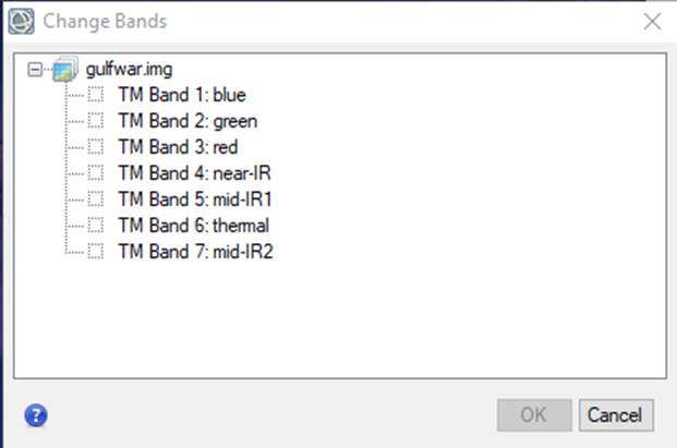
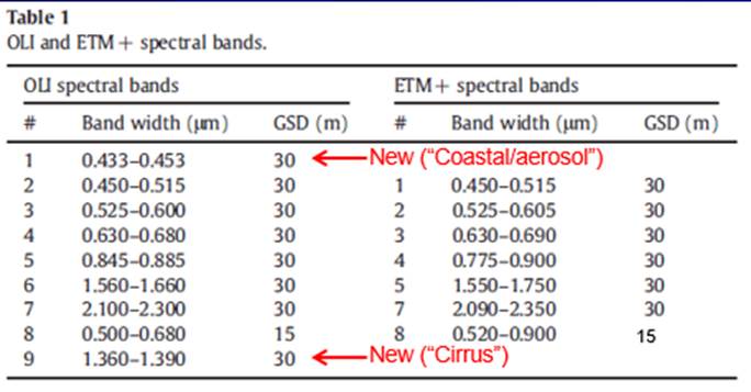
Note that this is a Landsat 5 image (not Landsat 8 which we used last week). Landsat 5 carried the Thematic Mapper (TM) sensor, not the Operational Land Imager (OLI) that is carried on Landsat 8. Landsat 7 carried a sensor called the Enhanced Thematic Mapper (ETM). TM and ETM are pretty similar, however, Landsat 5 does not have the Band 8 that is carried by the ETM. Note that, with TM (and ETM), the band assignments are a bit different than with OLI:
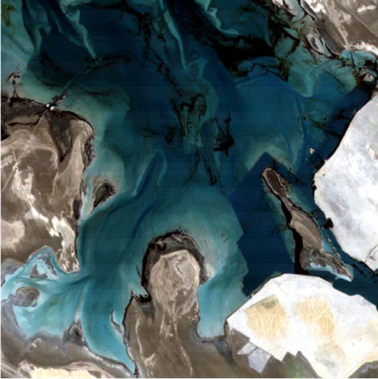
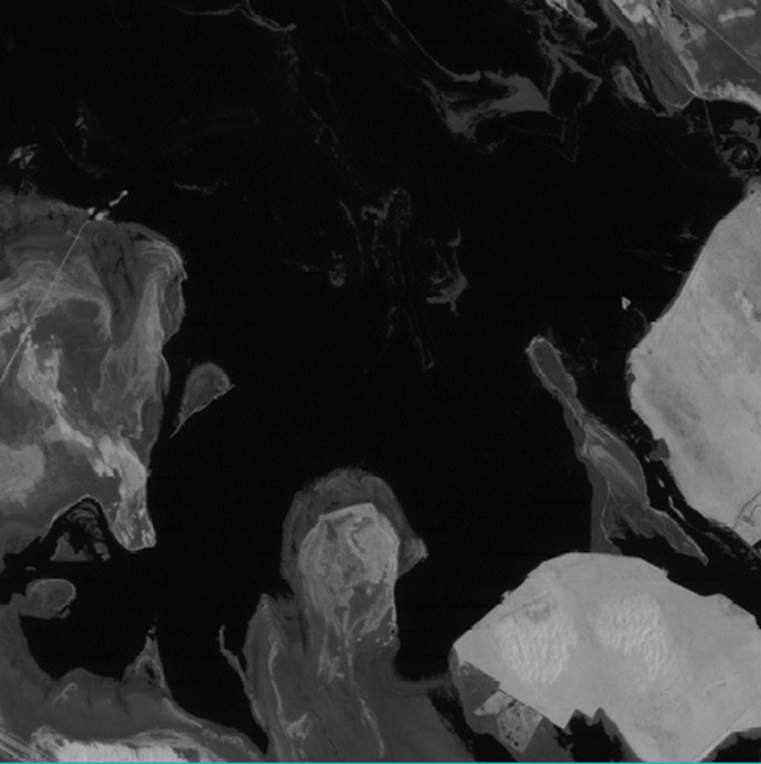
From the Change Bands dialog box, select the bands necessary to display the image in true color; TM Bands 3, 2 and 1 in the red, green and blue color guns, respectively. Using a Linear enhancement, the image should look something like this:
Take a look at the image. Refer to the online publication by Bauman as you do to familiarize yourself with the area. Go ahead and reload the image with different band combinations and different enhancements (as explained in last week’s lab) if you would like.
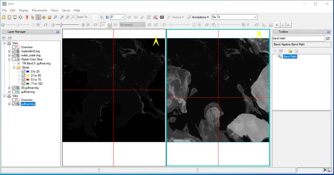
Step 3: View single bands. To view each band in greyscale go to the Data Manager dialog box (File-Data Manager), select TM Band 1 and Load Greyscale. Take a look at the image. Then try looking at each of the other bands one at a time. You can do this quite simply by going to the Data Manager dialog box, clicking on another band and clicking the Load Greyscale button again. Note that you can see different things with each band.
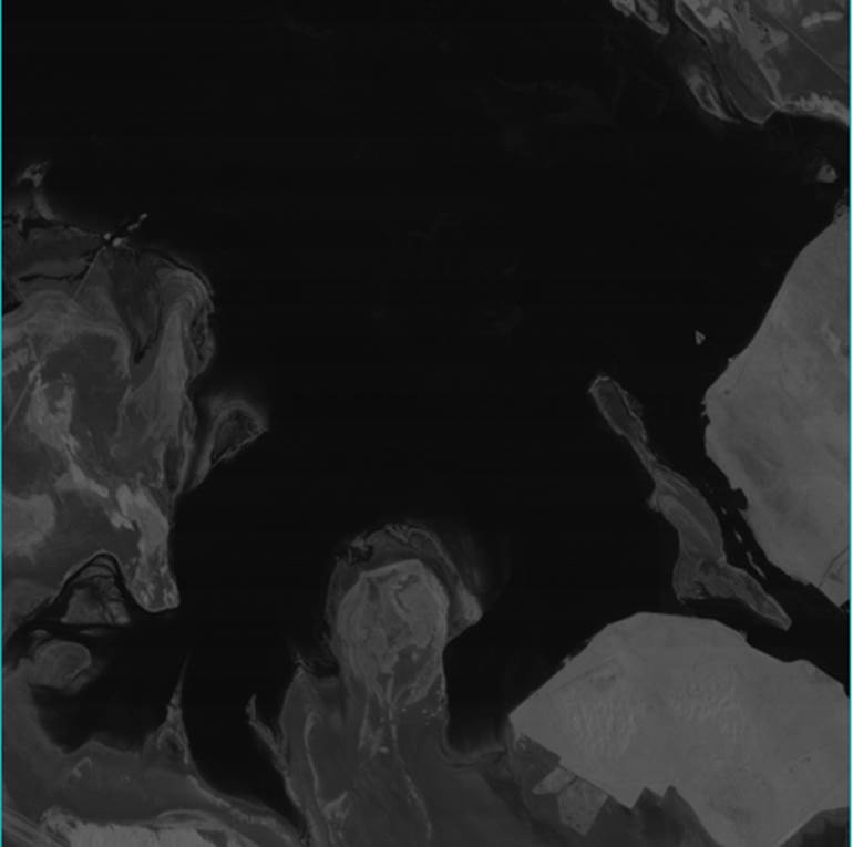
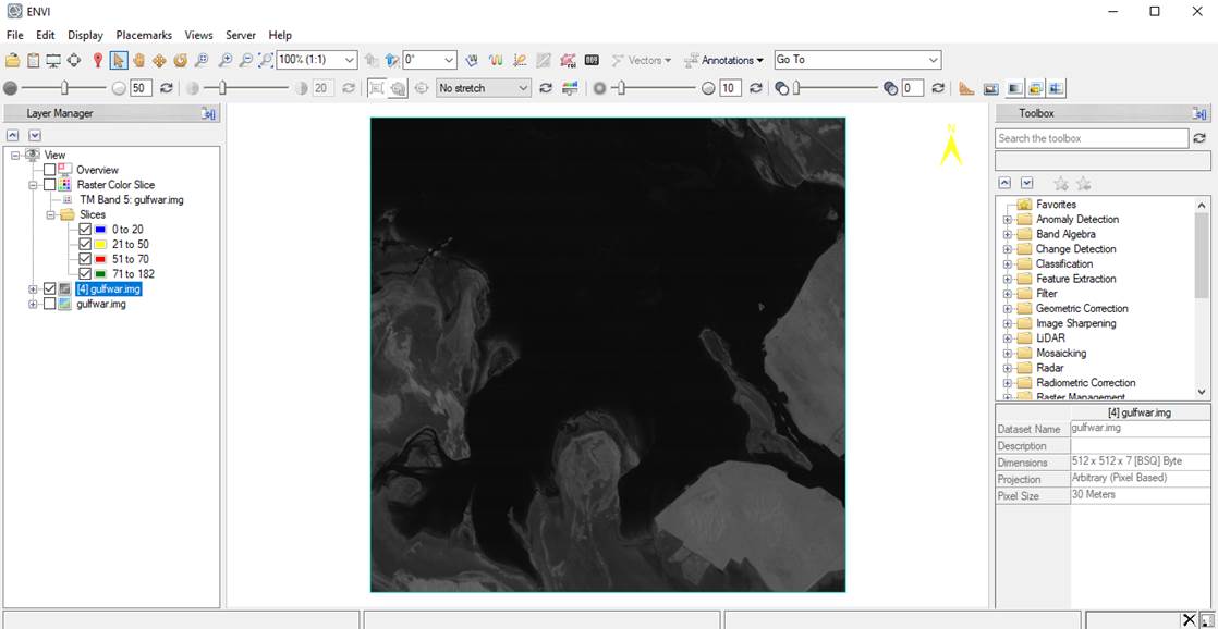
In particular, note that in Band 4, the near-IR, the water appears uniformly dark and the land appears as various shades of light grey. Like this:
In Band 5, mid-IR1, various lighter grey blobs appear in the water (areas that were dark in Band 4). Like this:
Step 4: Viewing Frequency Distributions and Sampling Brightness Values. Let’s take a look at the frequency distribution of brightness values for each band. To do this, go the Layer Manager window and right-click on gulfwar.img and select Quick Stats. This will bring up the Statistics View dialog box. Go to the Select Plots dropdown and select the Histogram for Band 1. You should see this:
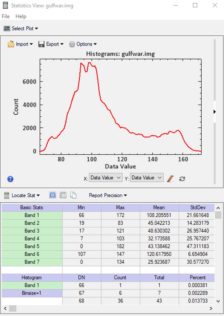
In the histogram, the “Data Value” represents the brightness values (also known as the “digital number” or DN) for individual pixels. These DNs are an index to the amount of EM energy that is being reflected from a given pixel. The “Count” is the number of pixels with a given brightness value. The lower portion of this window shows the minimum, maximum, mean and standard deviation of brightness values for each band. In the lower half of this window, you can use the slider to scroll down and see the Count for each DN. There is a single pixel with a DN of 66 and 6 pixels with a DN of 67. Scolling down, you can see that there are 7,394 pixels with a DN of 100. The data from this table were used to create the plot in the upper half of the window.
Take a look at the other histograms.
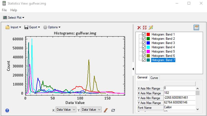
Clicking on the small black arrow to the right of the plot expands the window and provides a color legend for the lines. Now turn off (uncheck) all of the plots except Band 5.
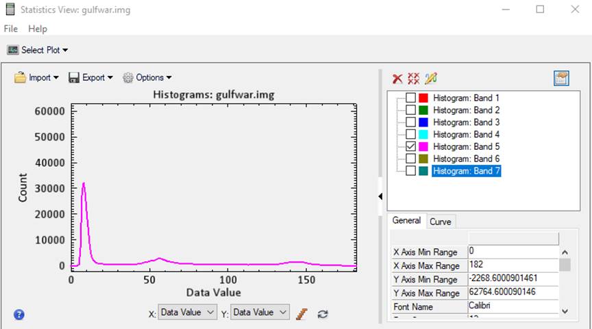
From Bauman’s paper, you will recall that he concluded that this band gives you the best discrimination of water, oil and land. Put the histogram window off to the side and view TM Band 5 in gray scale. Play with the contrast (enhancements) a bit until you can see what Bauman was talking about. Now take another look at the histogram. In the histogram, notice that there are three distinct “bumps.” These probably represent different categories of surface feature (Note: you may want to include a copy of this histogram in your lab report. Using the Snipping Tool, as described in last week’s lab is one way to grab this.). Our next task is to figure out what each of these features (the 3 bumps in the histogram) represents.
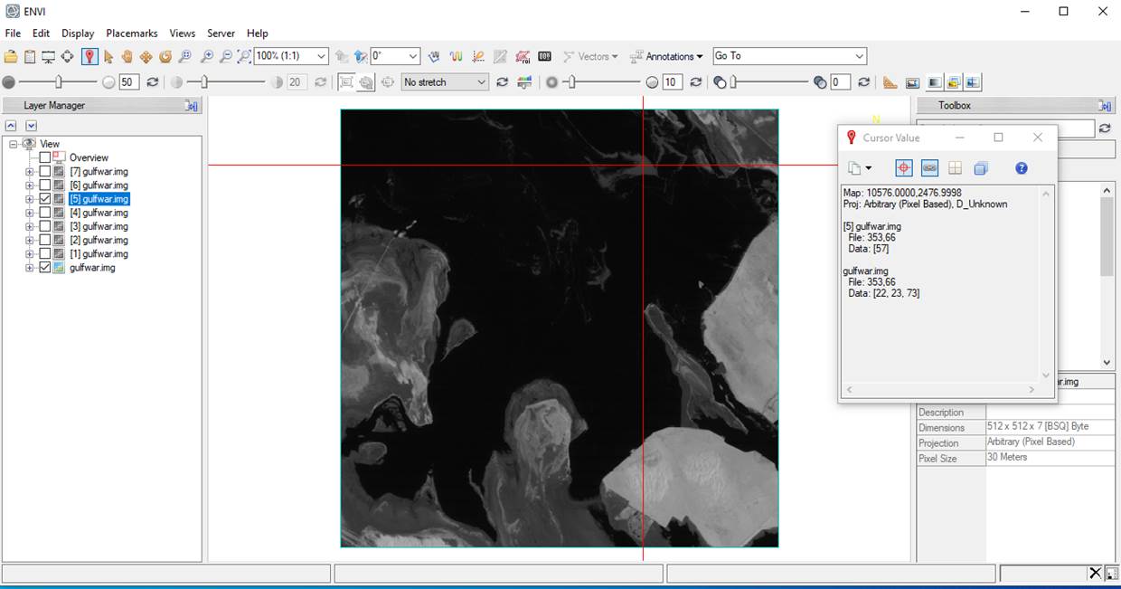
Let’s sample some of the brightness values in our scene. In the Layer Manager uncheck the greyscale
version of each image except Band 5. Then click on the Cursor value tool ![]() (located near the top left of the ENVI
display). A Cursor Value dialog box
will open and a set of red cross hairs will appear in
the image. You can now use your cursor to move around the image and sample DNs
for various parts of the image. See if you can figure out what each of the
three “bumps” in the frequency distribution represent.
(located near the top left of the ENVI
display). A Cursor Value dialog box
will open and a set of red cross hairs will appear in
the image. You can now use your cursor to move around the image and sample DNs
for various parts of the image. See if you can figure out what each of the
three “bumps” in the frequency distribution represent.
After some fiddling around, you will probably conclude that the left bump represents brightness values for water, the middle bump mostly represents oil (and maybe some land as well) and the far right bump represents land. You may want to refer to Figure 6 in Bauman’s paper as you sample your image. You will need to select some potential break points that separate these classes, like this:
Table 1:
|
Cover Type |
Minimum Brightness |
Maximum Brightness |
|
Water |
|
|
|
Light Oil |
|
|
|
Heavy Oil |
|
|
|
Land |
|
|
The distinction between light and heavy oil is arbitrary. Based on looking at Bauman’s results, let’s assume that heavy oil has a higher brightness value than light oil.
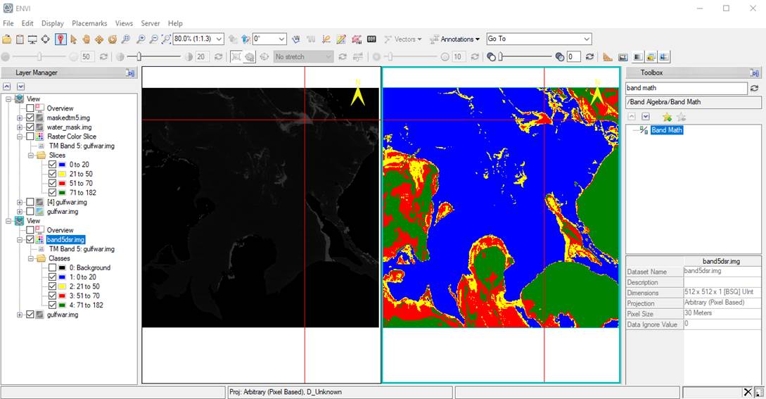
Step 5: Create a Raster Color Slice: Density slicing. We
now want to assign a unique color to each range of brightness values that we
defined in Table 1. We will use a
different color for each cover type. We
call these “Pseudo-colors” because these are not the “True colors” we would see
on the ground or if you were looking down from an airplane. In the Layer Manager, right-click on
the Gulfwar.img and select New Raster Color Slice.
In the Data Selection dialog, select Band 5 and click OK. This
brings up the Edit Raster Color Slices: Raster Color Slice dialog.
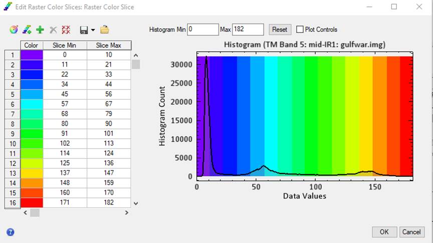
We want to create a unique “Color
Slice for each of the 4 categories in Table 1. Start by clearing all of the color slices ![]() . Then add a color slice
. Then add a color slice ![]() . I decided to have my first slice cover DNs
from 0 to 20 and I feel that this does a pretty good job of capturing the
water. Click on the Slice Max box to enter your max value for this
slice, then click on the color box to select an appropriate color,
resulting in:
. I decided to have my first slice cover DNs
from 0 to 20 and I feel that this does a pretty good job of capturing the
water. Click on the Slice Max box to enter your max value for this
slice, then click on the color box to select an appropriate color,
resulting in:
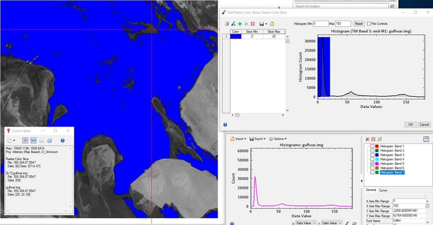
Continue to add slices to represent
the other 3 categories in Table 1. My final image looks like this:
Light and heavy oil are yellow and
red, respectively and land is green. Your image will look a bit different
depending on the min/max values you selected for each of the 4 categories in
Table. 1.
NOTE: it is important that
you assign a color to each of the brightness values in the image. If you edit the starting or ending value for
one range, you need to adjust the starting or ending value for the adjacent
range.
Save your Color Slice. When you have a set of color slice ranges
that you like, you need to save them. To
do so, in the Edit Raster Color Slices dialog box, select Save color
slices to file ![]() .
Be sure to select your working folder and select an appropriate file name; something like
Band5_color_slice.dsr. Note that ENVI will automatically give this file the “.dsr” suffice (density slice range) so you can easily
recognize it. You can and should also save this as a single band image
by Export as a Class Image from the same
.
Be sure to select your working folder and select an appropriate file name; something like
Band5_color_slice.dsr. Note that ENVI will automatically give this file the “.dsr” suffice (density slice range) so you can easily
recognize it. You can and should also save this as a single band image
by Export as a Class Image from the same ![]() dropdown. A good name might be Band5DSR.img. NOTE:
it is a good idea to always give your image file names a “.img” suffix. Not
required but I find that it helps me keep track of files.
dropdown. A good name might be Band5DSR.img. NOTE:
it is a good idea to always give your image file names a “.img” suffix. Not
required but I find that it helps me keep track of files.
Question: What are the results of your density slicing at this point? Did you run into the same problem of misclassification of inland areas as P.R. Baumann did? Why did that happen?
Let’s start by removing all of our greyscale views from our Layer Manager, except Band 4. (Remove the others by just right-clicking on each of them and go to Remove)
-Uncheck everything except the band 4 greyscale image. This leaves something like this:
-Click on the Cursor Value icon
![]() in
the ENVI toolbar, and explore the image to find the
range of values that captures all of the water.
in
the ENVI toolbar, and explore the image to find the
range of values that captures all of the water.
-. In the Toolbox search box, entered Build Raster Mask, then double clicked the Build Raster Mask tool.
-In the resulting Build Mask Input File dialog, selected the gulfwar.img image, then clicked OK.
- In the resulting Mask Definition dialog, chose Options-Import Data Range.
- In the resulting Select Input for Mask Data Range dialog, first toggled Select By-Band. Then selected TM Band 4 in the gulfwar.img file and clicked OK.
- In the resulting Input for Data Range Mask dialog, entered the min and max values that represent water, and clicked OK.
- Back in the Mask Definition dialog, selected an output path then entered an output filename for the output mask image. Then clicked OK. The result should look something like this, depending on what threshold value you chose:
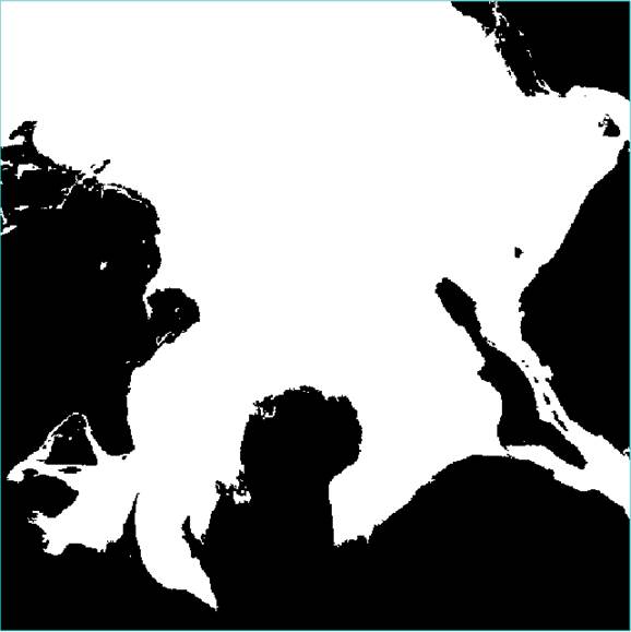
In this mask, all of the water has a value of 1 and all of the land has a value of 0. Just for fun, in the Layer Manager, you can right-click on the name of your water mask and go to Quick Stats. The Count values in the lower panel of the Statistics View window tell you how many pixels in the mask are land (with a DN of 0) and how many pixels in your mask are water (with a DN of 1). If your mask contains any DNs other than 1 or 0 then you did something wrong. Your mask may appear slightly different from mine since you may choose to use a slightly different threshold to separate land and water. This is OK.
Step 7: Using Image Arithmetic to Mask out Land. After you have come up with a land/water mask that you are happy with, we are ready to multiply band 5 by the land/water mask. What will happen to reflectance values on band 5 when they are multiplied by the values in your land/water mask? How will it help the analysis?
The multiplication is done by using the Band Math tool in ENVI.
-In the Toolbox search box, entered Band Math, then double clicked the Band Math tool.
-In the resulting Band Math dialog and the Enter an Expression box, enter “b1 * b2” then click on the Add to List button:
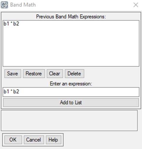
Then click on OK. We just defined a generic math function: we will multiply band 1 (which we called “b1”) by band 2 (which we called “b2”). Now we need to assign specific bands in specific image files to our two variables; b1 and b2. As soon as you clicked OK, the Variables to Band Pairings dialog box should have appeared.
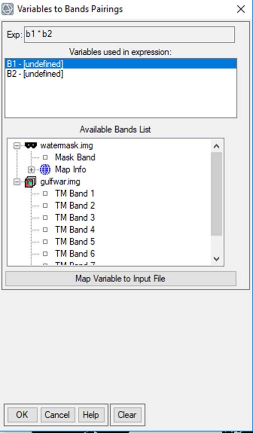
This dialog indicates that b1 and b2 are currently undefined.
-In the Variables used in expression box, B1 is currently highlighted. In my Data Manager you can see that my land/water mask is called “watermask”. Clicking on “Mask Band” will assign this to B1. Next, you need to assign TM Band 5 to B2. To do this, you click on B2 in the Variables used in expression box and then click on TM Band 5 in the Data Manager.
-Next to Enter Output Filename, click on Choose, and enter an output filename; something like “maskedTM5.img” might be appropriate. Finally, click on OK to execute the Band Math function. This will run very quickly.
- The output from your Band Math function should appear in your Data Manager dialog box.
Step 8: View the output image and create a Raster Color Slice
-In the ENVI toolbar, go to Views-Two Vertical Views. In Layer Manager window, click on the new View that has just been created. Then,
-In the Data Manager dialog box, click on the TM Band 5 in the Gulfwar.img file and load it as gray scale. Then go to Views-link views and click on the Link All button, then OK. This should result in something like this:
Note that, by using the Cursor Value dialog box, you can see that the values for all of the land now have a value of 0. Also note that for everything that is NOT water, the data values remain unchanged. This is exactly what we wanted. We now want to reload the color slice that we created for Band 5 and create a comparable color slice for our “maskedband5.img” file. To do this:
-In the Layer Manager window, make sure that you have clicked on the right-side view to make this window “active.” .
-In the Data Manager dialog,
right-click on band5dsr.img file gulfwar.img-band 5
and go to Load Greyscale. This will actually bring
up your color slice of this image, not a greyscale version. It will now look
like this:
-Back in the Layer Manger, click on the first view (left panel) to make this active. Now right-click on your maskedTM5.img file and go to Raster Color Slice. This will bring up a NEW color slice for this band….which is NOT what we want. We want to reload the color slice that you created above. To do this:
-In the Edit Raster Color Slices:
Raster Color Slice dialog box, click on the Clear Color Slices button ![]() .
Then on the Restore Color Slices button
.
Then on the Restore Color Slices button
![]() .
.
-In the Restore Raster Color Slices File dialog, select the color slices file you created above. It should have a “.dsr” suffix. It should look something like this:
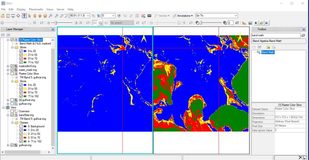
Note that nearly the entire image is now in the “water” class.
Why?
Think real hard……
Take a look at your Edit Raster Color Slices: Raster Color Slice dialog box. Note that the Slice Min value for your first class (the water class) is 0. This was correct for your unmasked band 5 image but NOT for your maskedband5.img file. Given our little band math trick, most (but probably not all) of the land pixels now have a value of 0. So, we need to make some changes.
-In the Edit Raster Color Slices: Raster Color Slice dialog box, click on the Slice Min box for class 1 (the water class) and change this to a value of 1.
- Click on the Add color slice
button ![]() and for the color box for this new 5th
class, give it the same color that you used for the land class and
and for the color box for this new 5th
class, give it the same color that you used for the land class and
- Define BOTH the min and max values for this new 5th class as 0. The result should look something like this:
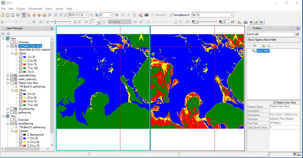
Looks pretty good doesn’t it!?
Step 9: Area Statistics. We would like to come up with an estimate of the area covered by water, light oil, heavy oil and land for both our unmasked and masked versions of TM Band 5. Based on Step 8, you should have the unmasked version of TM Band 5 open in one view and your masked version of TM Band 5 open in another display. To obtain your area estimates,
-In the Layer Manager window, right-click on the name of each file (first the TM Band 5 Raster Color Slice, then the Band Math (b1*b2) maskedband5 Raster Color Slice) and get Quick Stats, then
-In the Statistics View window, go to File-Export to text file to save these quick stats results to a file that you can open in Excel.
What you really want are the Histogram data: the DNs and Count for each DN. This will be in the text files that you save. Bring both files into Excel and calculate the number of pixels (Count) in each cover type. You will need to refer to your Table 1 to recall the range of DNs that correspond to each cover type. Also recall that, in your masked TM Band 5 image, most of the land has a DN of 0 but there will probably be a few pixels with high DNs (the range that you called “land” in the unmasked band 5 image) that did not get “captured” by your land/water mask.
NOTE: In order to calculate the area in each cover type, you need to know the pixel size. For this image, the pixel size is 30 meters by 30 meters. After you have imported the data into Excel, you can calculate the area in each cover type by multiplying the number of pixels by the area of each pixel. I’d suggest that you present the area in hectares. You can use various spreadsheet functions to calculate the same summary statistics that are included in Baumann's Tables 2 & 3. Why are your values different from his? You can also use Excel with your data to create a histogram or two.
Step 10: Hard copy maps. You will want some color images to include in your lab report. The easiest way to do this is to use the Snipping Tool as you did in the previous lab. The .jpg file you create in the Snipping Tool can then be inserted into your MS Word file as you write your lab report. You can also use MS Word to create a color legend for your images. This is a particularly nice touch. To do this, first insert the .jpg file from the Snipping Tool into your MS Word file. You can then use the drawing tools to insert a series of small boxes directly below the image. You can then manipulate the fill color to match the colors in your map. We will show you how to do this in lab.
There is no need to print anything out!
Simply submit your final lab report via email to your TA. She will grade it and return it to you with
comments. I’m trying to go paperless!
BE SURE TO SAVE A COPY OF ALL OF YOUR FILES TO YOUR ONEDRIVE AND TO YOUR
USB DRIVE. YOU WILL UNDOUBTEDLY NEED TO
REFER TO THESE FILES AS YOU PREPARE YOUR LAB REPORT (discussed below).
FINALLY, Prepare a Lab Report Summarizing your Analysis. Your report should be no more than five double-spaced pages of text. Three pages will probably be sufficient. Your lab report must include all the sections described in my “Guidelines….” Document (see link below). Your lab report will not need to include an Introduction section. This webpage, and Bauman’s paper should provide sufficient background and there is no need for you to rehash this material. Your lab report should provide a brief Methods section. You don’t need to rehash the methods that I have presented in this webpage but you might find the need to provide a brief section that explains anything you did that was a bit different than the methods described above. The bulk of your lab report should focus on the presentation of your RESULTS and on a DISCUSSION of the significance of these results. Use tables, figures and images to support your writing. As a bare minimum, I expect to see the following figures and tables:
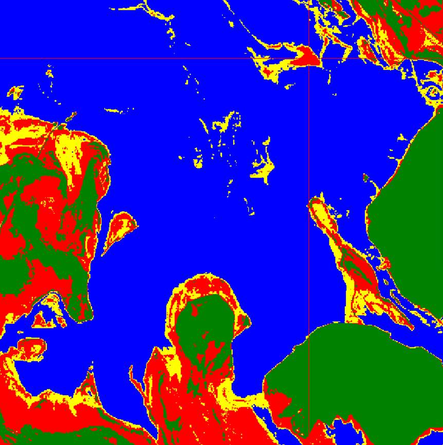
1. A figure showing the results of applying your Pseudocolor scheme to TM5
2. A figure showing the results of applying your Pseudocolor scheme to the
product of TM5 and your Land/Water mask
3. A table showing the number of pixels, hectares and % of study area in land,
water, light oil and heavy oil for the two figures listed above. Note that you
will need to do some conversions to calculate area in hectares from the number
of pixels in each cover type. The pixel size in your image is 30 meters by
30 meters. You can confirm this by
going to Utility-Layer Info in the Viewer window. Look under the General-Map Info
section of this box.
Note: In your report, it is OK to refer to the various Thematic Mapper band numbers (TM4, TM5, etc.) but it is not OK to refer to "filename_for the land/water mask.img" or "finalimagename.img." These filenames will be meaningless to your reader and the reader really doesn't need to know these filenames anyway. It is OK to refer to your “land/water mask." You will need to come up with another way to refer to the product of TM Band 5 and your Land/water mask.
Feel free to include additional figures and tables as you see fit. You should also be sure to include a Literature Cited Section. You might find it useful to refer to the book: Day, R.A. 1998. How to Write and Publish a Scientific Paper. ISI Press. An online version of this book might be available by clicking here. This is an "e-book" that can be "checked out." I'm a bit unclear on what this means. If this link does not work, try accessing the book by looking it up your self in the library's online catalog. This book provides an excellent discussion of each section of scientific papers and it also provides some good advice about editing and style.
You should also my Guidelines for the Preparation of Lab Reports web page. This provides more details about what I expect to see in a lab report.
Originally Created by: N. Antonova, D. Wallin
Return to ESCI 442 Lab Page
Return to ESCI 442 Syllabus
Return to David Wallin's Home Page