ESCI497Z:
UAS for Environmental Research and Monitoring
North
Fork Nooksack: Channel Elevation Change using LIDAR and UAS SFM
Objective:
Floodplain channel dynamics and channel migration have significant impacts on
salmon habitat. We will use both LIDAR data and UAS data to quantify floodplain
dynamics for a portion of the North Fork of the Nooksack River.
You
will be preparing a short (3-5 pages of text) write up describing your flight
plan.
PROCEDURES:
Step
1: Get the data. All of the data for this lab are located
in: J:/saldata/esci-497/N_Fork_Nooksack. This folder
is huge. Nevertheless, I’d suggest copying the ENTIRE
THING to your own folder on C:/temp. (At
the end of the day, I’d strongly urge you to delete
this stuff from C:/temp to make space for others.
Step
2: Review metadata (processing reports)
-LIDAR:
We
will use a LIDAR dataset from 2005. Take a look at the
processing report “2309 Final Report.pdf” for information about this data set.
-UAS: I did
flights over two days to cover this area. I have already processed all of the
images using Agisoft following the same general procedure that you used last
week from the heron colony. On Aug 30, 2016, I flew from our field off of Rutsatz Rd.. Take
a look at the processing report (Aug30_2016.pdf). These fights
covered the west half of the study area and included nearly 2400 images. In the
report, you can probably see that, in order to get sufficient overlap, I cam up with two different flight plans; one with flight
lines oriented at 360 degrees (due north) and the other at 300 degrees. I was
hoping that this would provide sufficient overlap to align the images over the
areas with tall trees. As you will see in working with the data, I still ended
up with big gaps; sections over forested areas where I
was unable to align the images. On Sept. 1, I flew from another site on the
north side of the river and about 2 km NE of our field along Rutsatz Rd.. This dataset
(described in Sept1_2016_flts1_5.pdf) includes over 4000 images. For these
flights, I increased the sidelap from 60% to 80%. I
was unable to reduce the flight speed to increase frontlap
so I simply flew most of the area twice; I repeated the first two legs of the flightplan. This is the portion of the
flight that mostly focuses on the south side of the river. This improved
the overlap somewhat and I did not have as many gaps.
The total area covered by the 2 days of flying covered
about 5 kilometers of river.
Step
3: View the data in ArcMap
We will mostly be working in ArcMap today. As I
mentioned above, I’ve done the Agisoft processing for
you. Doing so (with the ~6400 images) took days of processing. As you know, the
two most time consuming steps in Agisoft involved the photo alignment and the
generation of the dense point cloud. I typically start one of these tasks as I
left my office in the evening and the job was usually complete by the next
morning.
Start by opening ArcMap. Add all of your data layers
by clicking on the ![]() Add data
button. From the Add Data dialog box,
you may need to click on the
Add data
button. From the Add Data dialog box,
you may need to click on the ![]() Connect to a folder
button to navigate to your workspace on C:\temp. I am working in
C:\temp\wallin|\n_fork_nooksack. Do not try to work off of
the J-drive or off of your U-drive. You will not have enough space!!!!!!!! You should
see seven .tif files. Go ahead and add all of them to
your ArcMap project. These files include:
Connect to a folder
button to navigate to your workspace on C:\temp. I am working in
C:\temp\wallin|\n_fork_nooksack. Do not try to work off of
the J-drive or off of your U-drive. You will not have enough space!!!!!!!! You should
see seven .tif files. Go ahead and add all of them to
your ArcMap project. These files include:
UAS:
all
with UTM projection
Aug30_2016_ortho_big_utm.tif (ortho of west half of
study area; 4 cm pixel size)
Sept1_2016_flts1_5_ortho_utm.tif (ortho of east half
of study area; 4 cm pixel size)
Sept1_2016_flts1_5_dem_utm.tif (DEM including both E
and W half of study area; 16 cm pixel size)
LIDAR:
all
with 2 meter pixel size and UTM projection
1st
return (top of canopy)
Nook2005_dem_2m.tif
Nook2005_dem2m_shade.tif (shaded relief)
Last
return (bare earth)
Nook2005_dtm_2m.tif
Nook200r_dtm2m_shade.tif (shaded relief)
We do not have an ortho image of the area at the time
of the LIDAR flight but you can look at Google Earth to find something close.
And, the shaded relief DEM (Nook2005_dem2m_shade) does help you visualize where
the trees are at this time.
Click the various layers on and off to get a sense of
what has changed over this 11 year period. You will note a great deal of
channel migration and changes in riparian vegetation.
Step
4: Elevation change
Click on the ![]() Search
button. In the search box, type in “Raster calculator.” Select Raster Calculator (Spatial Analyst).
This is probably the second item in the list. This will bring up the Raster Calculator window:
Search
button. In the search box, type in “Raster calculator.” Select Raster Calculator (Spatial Analyst).
This is probably the second item in the list. This will bring up the Raster Calculator window:
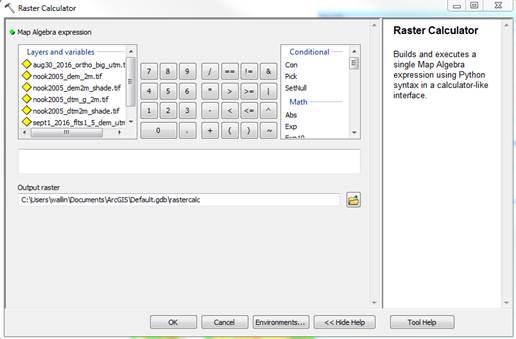
From here, things are pretty simple. Double-click on
the Sept1_2016_flts1_5_dem_utm.tif”, then click on the minus sign “-“, then
double-click on the Nook2005_dem_2m.tif layer. Then specify a location for your
output raster. I would strongly suggest creating a new folder in your workspace for
your output. When you wrap up today, you will want to save all of your output
but probably NOT all of the huge files that you are starting with. I created a
“nook_out” folder in my workspace, like this: C:\temp\wallin|\n_fork_nooksack\nook_out
Note that Arc limits you to filenames of no more than
13 characters:
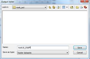
After specifying your output raster, click OK in the Raster Calculator window.
It will take a few seconds to complete this
calculation. The resulting output file will have a 2 meter pixel size and it
will be added to your Table of Contents in Arc. My result looks like this:
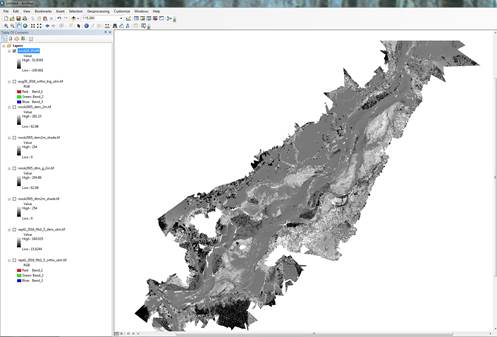
This grey-scale image is rather underwhelming and hard
to interpret. So, right-click on your difference image name and to Properties-Symbology. Click on Classified. Say “Yes” to calculating a
histogram. Select a color ramp that pleases you, then go to Classify and select some reasonable
class breaks. The default here is 5 classes but you can increase this if you would
like. Then click on OK-Apply. Here
is one possible way to symbolize the elevation changes:
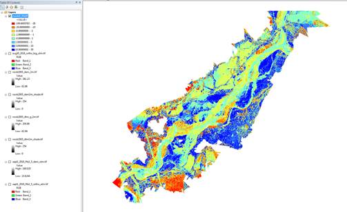
In this case, the warm colors represent elevation LOSS
between 2016 and 2005 (2005 elevations higher) and the cool colors represent
elevation GAIN over this interval. All elevations are in meters.
Reality-check:
Before diving too far into interpretation, let’s do a
reality-check. Take a look at the Ortho image from 2016. What feature(s) in the
study area would you expect NOT to change in elevation over this 11 year
interval?
Think real hard……..
How about the roads? Yes, some of the roads might have
been resurfaced but this would only result in a change of a centimeter or two.
And yes, there might be a few places where there might be some
slumping/subsidence but this is likely to occur in only a handful of places.
So, let’s take a look. Zoom in on a section of road
(with the 2016 ortho layer activated) and use the ![]() Identify
tool to get the elevation difference for this location. Record this value by entering this
into a spreadsheet. Zoom out and
move to another part of the study area and try again. Repeat this for a few
dozen locations that are well distributed around the entire study area and then
calculate the mean, maximum and minimum differences. From this, you should see
a systematic bias. One of the layers seems to be a bit higher than the other.
You can use your mean difference from your road points for bias correction (below).
Identify
tool to get the elevation difference for this location. Record this value by entering this
into a spreadsheet. Zoom out and
move to another part of the study area and try again. Repeat this for a few
dozen locations that are well distributed around the entire study area and then
calculate the mean, maximum and minimum differences. From this, you should see
a systematic bias. One of the layers seems to be a bit higher than the other.
You can use your mean difference from your road points for bias correction (below).
But first, which elevation layer is “wrong?”
GCP
data:
One the things that you should have copied along with
all of the other data is a folder called GCP_data.
This includes a shape file called “point.ge.” Add this to your Arc project.
This will add about 14 points, scattered across the study area. For the ones
that are located on roads, calculate the difference between the GPS elevation
(GNSS height) and the elevation on the 2016 and 2005 DEM elevations. Based on
these results, which layer seems to most closely align with the GPS elevations?
Bias
correction:
Go back to the Raster
calculator “correct” your 2016-2005 difference layer by adding or
subtracting the mean difference from your road points. After doing so, redo
your symbology.
Interpretation:
Zoom in on some of the big losses and gains and see if
you can figure out what is causing them. To help you interpret this, toggle
between the 20016-2005 elevation difference, the 2005 shaded relief, and the
2016 ortho images.
What are the drivers of these big (+ or – 10-20 m)
losses and gains?
What is the driver of the more modest (+ or – 1-2 m)
losses and gains?
Note that the maximum elevation loss is 100 m and the
maximum elevation gain is 52 m. Do these max/min values seem
reasonable/realistic? Are these values “real” or due to some anomaly in the
data?
Frequency
Distribution of Change in Channel Migration Zone:
Some of the area in our 2016-2005 difference image is
“upland” that is not within the channel migration zone. We would
like to quantify the amount and percentage of the area within the channel migration
zone has undergone different types of change. You can visualize the channel
migration zone by viewing the LIDAR-based bare earth shaded relief layer
(nook2005_dtm2m_shade.tif). Using this, I manually created a polygon that
approximately delineates the channel migration zone. Add the shapefile
channel.shp to your project (click the ![]() button
again and point to “channel” in the same folder with all of your other input
layers).
button
again and point to “channel” in the same folder with all of your other input
layers).
We now want to clip our 2016-2005 difference image
using the “channel” polygon. To do this, open the Arc Toolbox ![]() and
go to Data Management
tools-Raster-Raster Processing-Clip
and
go to Data Management
tools-Raster-Raster Processing-Clip
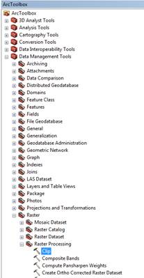
From the Clip
dialog box, your Input raster is
your 2016-2005 difference layer, the Output
extent is the channel shapefile. It is critically important that you check
the use Input Features for Clipping Geometry box! This is what forces
your input layer to be clipped to the exact boundary of our channel shapefile.
Specify an Output Raster Dataset
and, as before, I’d strongly urge you to put this in the folder with your
2016-2005 difference layer. Click OK to
run the clipping procedure. The output will be added to your project.
Note that this output layer consists of real numbers
(decimal values) defining elevation change within the channel migration zone.
To simplify this, we’d like to convert these to integer values.
To do this, in the ArcToolbox, go to Spatial
Analyst tools-Math-Int
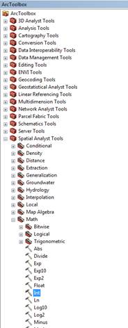
In the Int
dialog, simply specify your input layer and a name for the output layer (again,
put this in the folder with your other output files). You can then export the
attribute table, bring it into Excel and generate a frequency distribution.
Report:
As with last week’s lab, I would like you to prepare a
brief report based on your work today.